Honus Wagner: A Color Study of t206 Lithography
(acylic, mixing medium, canvas)
I have recently become absolutely enamored with “the Monster”. For those of you who are not familiar, the Monster refers to the t206 baseball card set that was distributed in cigarette and tobacco packs from 1909-1911. This was peak craze for the sport of Baseball in the United States, yet it was still undetermined which professional leagues were here to stay. With that said, there were 524 different player depictions. But it doesn’t stop there… the American Tobacco Company (ATC) was a house of brands and had 16 different brands which were advertised on the backs of these cards. To put it simply, this set is so deep that you can literally make up thousands of sub-sets to collect (16 backs of a single player, 1 of each back, team sets, league sets, entire set for a single back, etc).
But the single card that lives in baseball card lore is a portrait of Pirate’s shortstop Honus Wagner. Being one of the most popular superstars in the sport, it may surprise you to hear that Honus did not have many cards printed with his likeness. In fact, no one is exactly sure why only 200 examples have ever been known to exist. Many speculate that he simply did not want to support a tobacco company that marketed toward children. Others simply believe that Honus never agreed to have his likeness used and ATC (fearing recently passed legislation that protects one’s likeness from being used) simply pulled production. Whatever the reason may be, Honus Wagner’s t206 card has vaulted “the Monster” into legendary status. So much so, that a recent auction sold a Wagner for nearly $3.5 million.
So why am I rambling on about some pieces of cardboard from 110 years ago? NO, it is not the endless ways to collect… or the amazing checklist of Hall of Famers, derelicts, and felons…
It is because of the ARTWORK, which (IMHO) may be the best artwork ever distributed through mass production.
But so little is known about who the artists were… or even how these lithographs were specifically produced. So with a global pandemic and many nights over a glass of my favorite IPA or whiskey… I set out to research and develop my own best guess at how Baseball’s Mona Lisa was printed.
After several hours of research, I landed on the following print layers (in order):
1. Yellow
2. Black
3. Brown
4. Buff
5. Light Blue
6. Dark Blue
7. Grey
8. Pink
9. Red
Note: Honus does not leverage dark green. For argument sake… the entire uncut sheet would likely be Yellow, Black, Brown, Buff, Light Blue, Dark Blue, DARK GREEN, Grey, Pink, and Red
I could go into a TON of detail on why I picked these colors and this order… and would be happy to discuss further… but for the sake of time (and the effort of typing) I will summarize my sources.
1. Scot A. Reader’s “Inside t206” found here: https://oldcardboard.com/t/t206/Insi…al-edition.pdf (to understand the process of printing a t206)
2. The Ink Color thread from the net54baseball.com archives found here: https://www.net54baseball.com/showthread.php?t=148581 (to see examples of color variations and member arguments about the process)
3. Specifically, the El Encanto proof posted by atx840 in this thread (shows available lithography colors used during this period)
4. Jeff Burdick’s Honus Wagner example found here: https://en.wikipedia.org/wiki/T206_H…eball_card.jpg (to understand which colors were used in Honus and to judge how the colors overlap and which likely came first)
5. Google image search for a wide range of color variations of t206.
To begin the process, I painted the canvas to simulate aged card stock. This is out of necessity to make the card look 110 years old… and it is necessary to do at the beginning so that imperfections in the “paper” can show through the “ink”.
After that, I applied a mixture of mixing medium to acrylic paint to make it semi-transparent. I would then apply each layer over the previous layer. In the case of almost all paints… the layering of two colors (yellow and pink for example) would result in a near-perfect match (like the yellow-orange in Honus’ background). There were a few instances, however, where I would have to come back in and touch-up colors to match better to the original. This was the case with any lighter pigment, because the mixing medium would have a clouding effect over the previous layer which made the previous layers appear “milky”. For this reason, I had to re-paint the dot-matrix (black) 3 times.
This process was repeated until we reached a final image:
Lucky #13
(acrylic, canvas)
As a Christmas gift, I wanted to give my parents a present that they would always remember. On canvas, I attempt to recreate their favorite hole at their favorite golf course. What makes this hole unique is the “split green” where a creek literally runs through the middle of the green. Although I usually struggle hitting my ball to the middle of the green on any other hole… I somehow always seem to drop my ball in the middle of this creek on lucky #13.


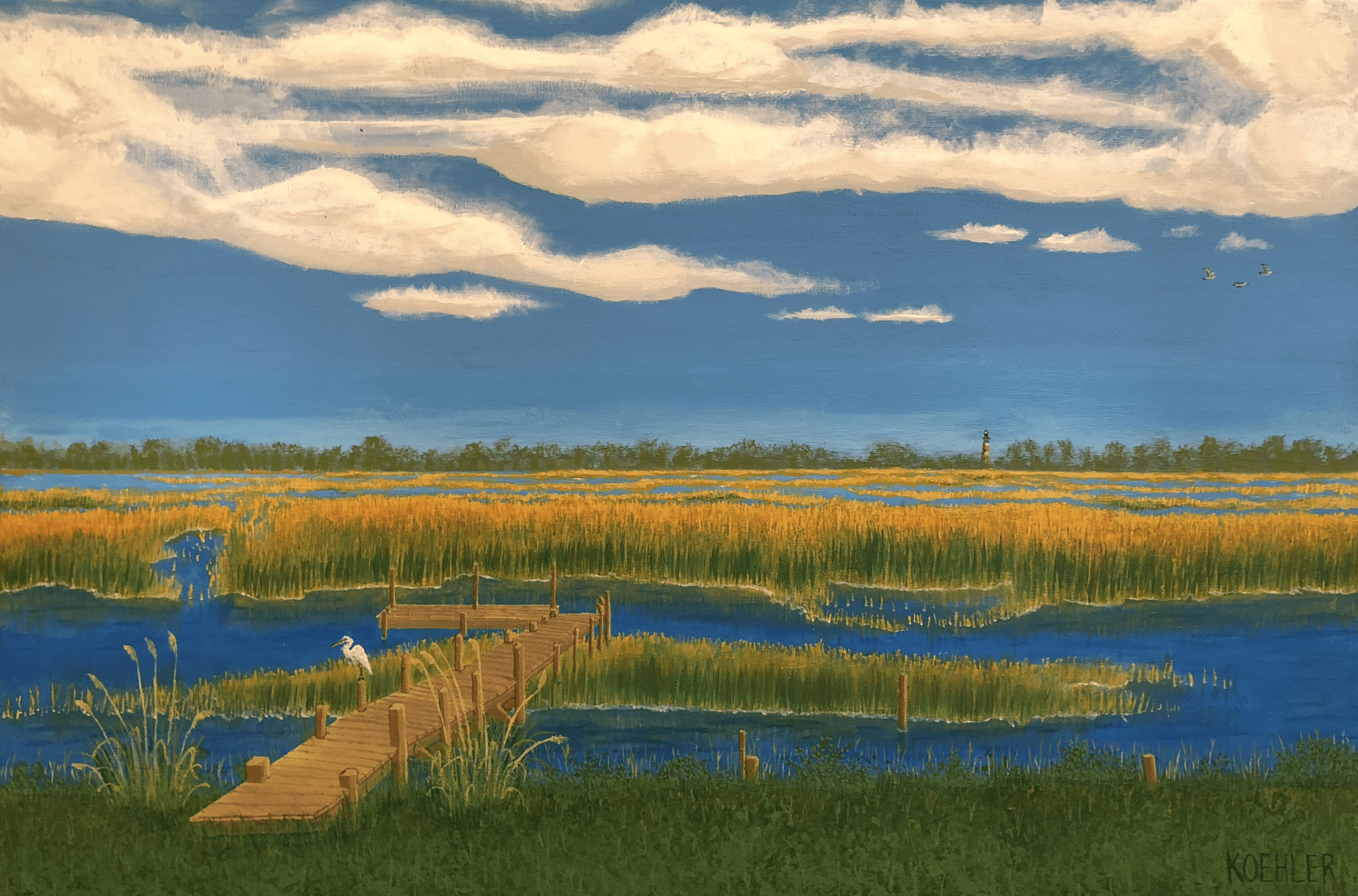
Seaward Drive
(acrylic, canvas)
For Mother’s Day, I wanted to surprise my wife with a painting of the backyard of her childhood home. Nestled on a marsh island, my wife grew up with the most majestic coastal views. Personally, I feel like it looks its best around 4:30 when the sun is still strong enough to reflect a brilliant golden hue from the marsh grass… but its close enough to sunset where the water doesn’t reflect bright sunlight back into your eyes. This is my attempt to capture 4:30 in my wife’s backyard.
Nursery Art
As I stepped into fatherhood, I thought it would be fun to create artwork for my children’s nurseries. These were my first paintings (since high school art class) and ultimately rekindled my interest in making art.
Elephant and Bird
(acrylic, canvas)


Three Wise Monkeys
(acrylic, canvas)
